
FOCUS ON…
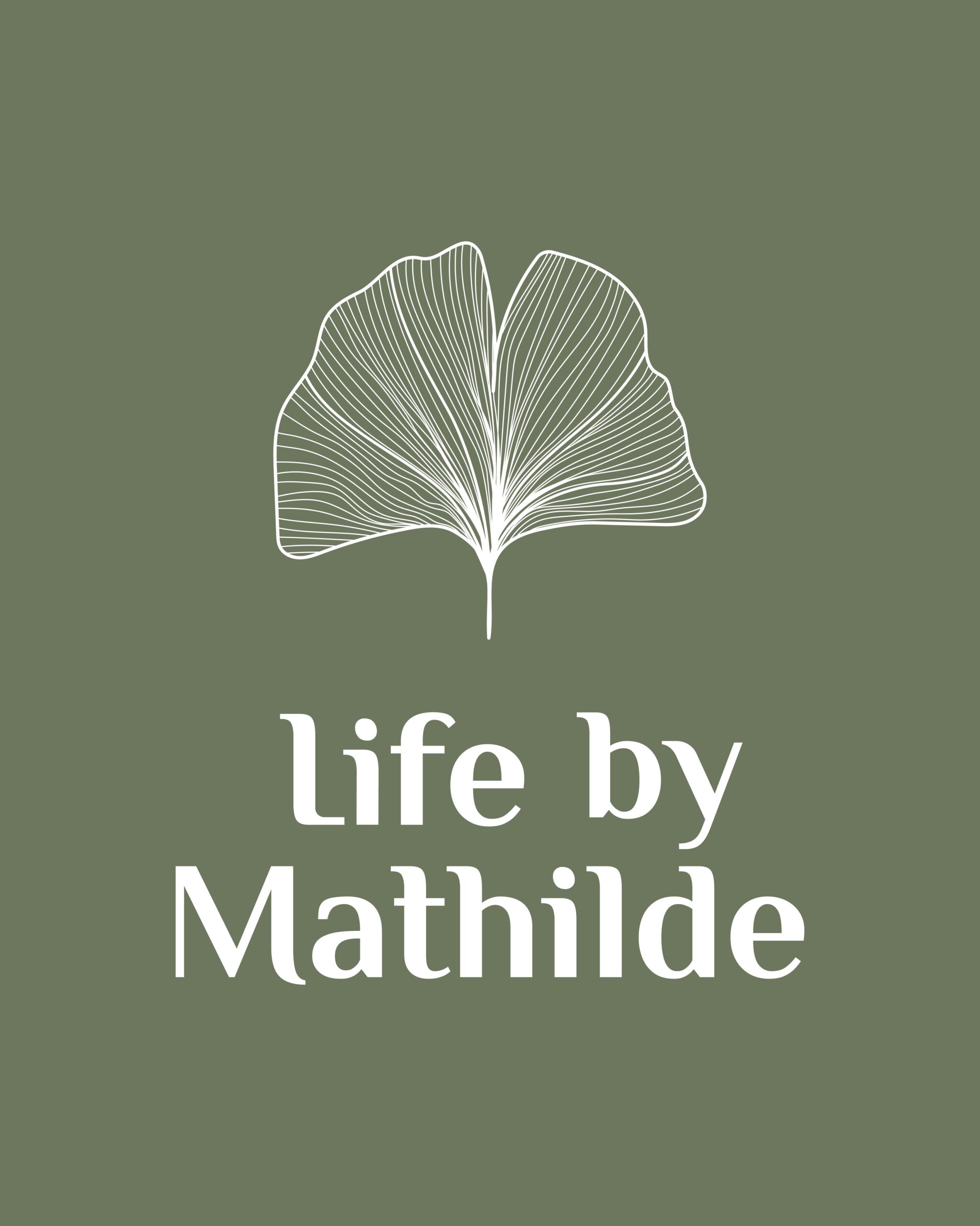
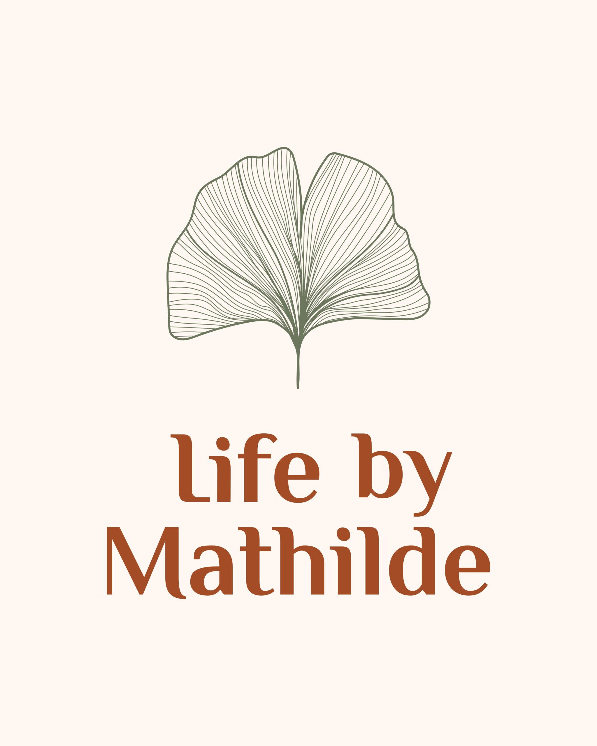
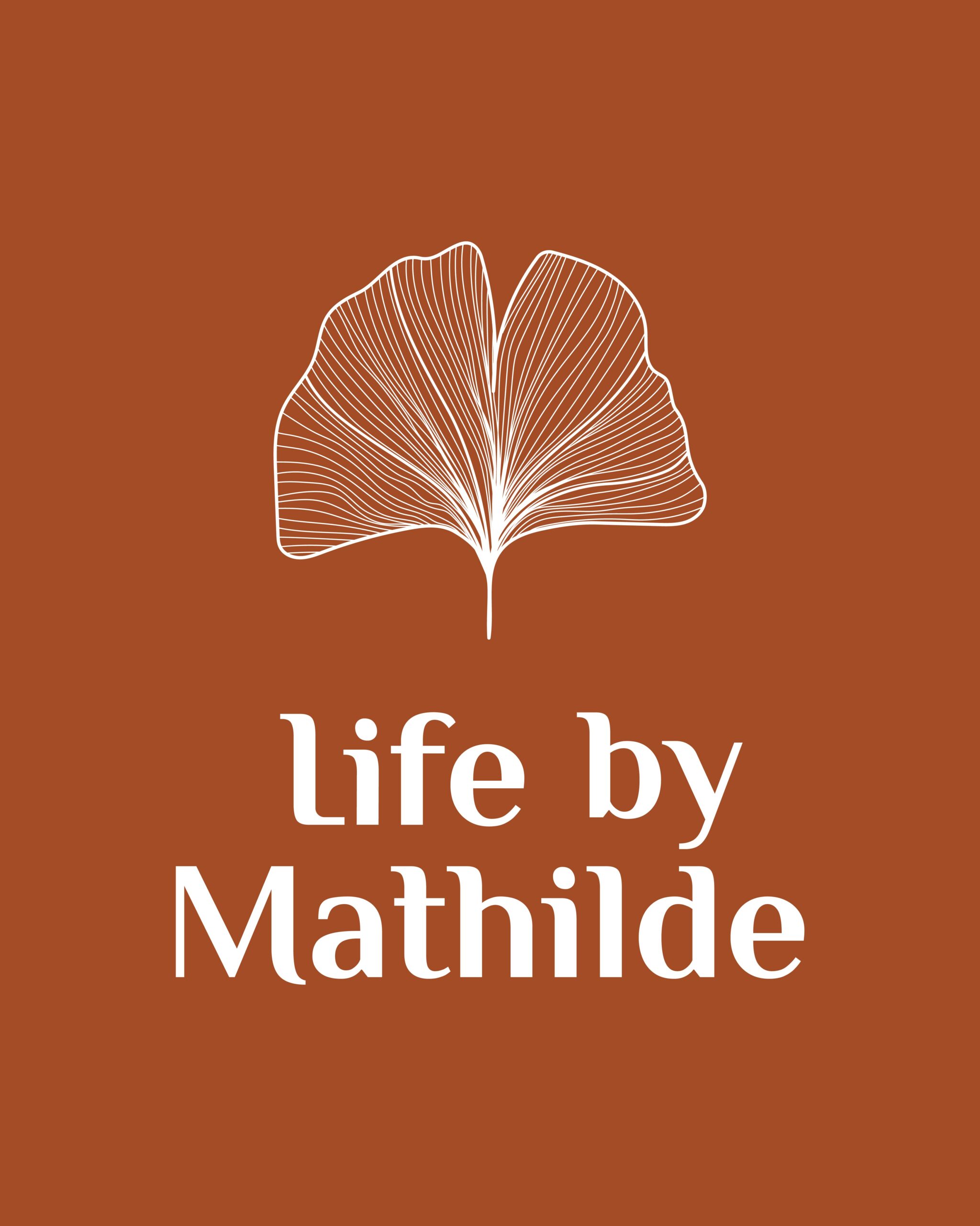
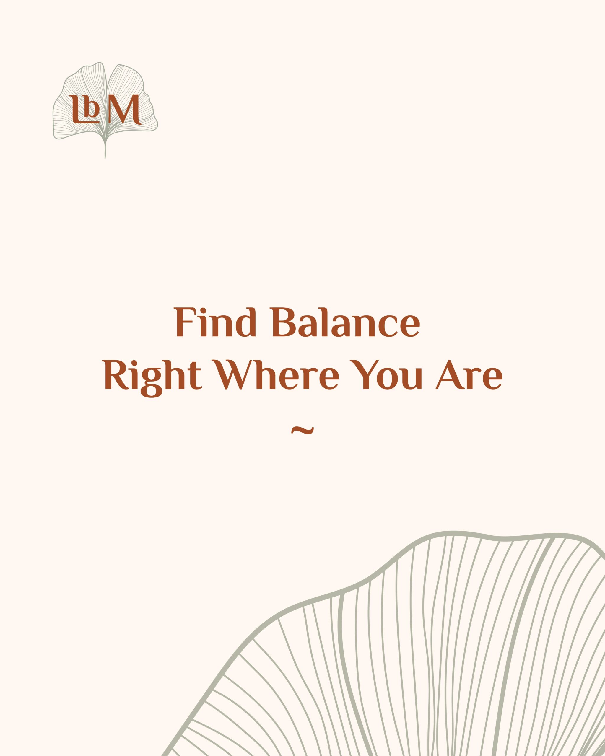
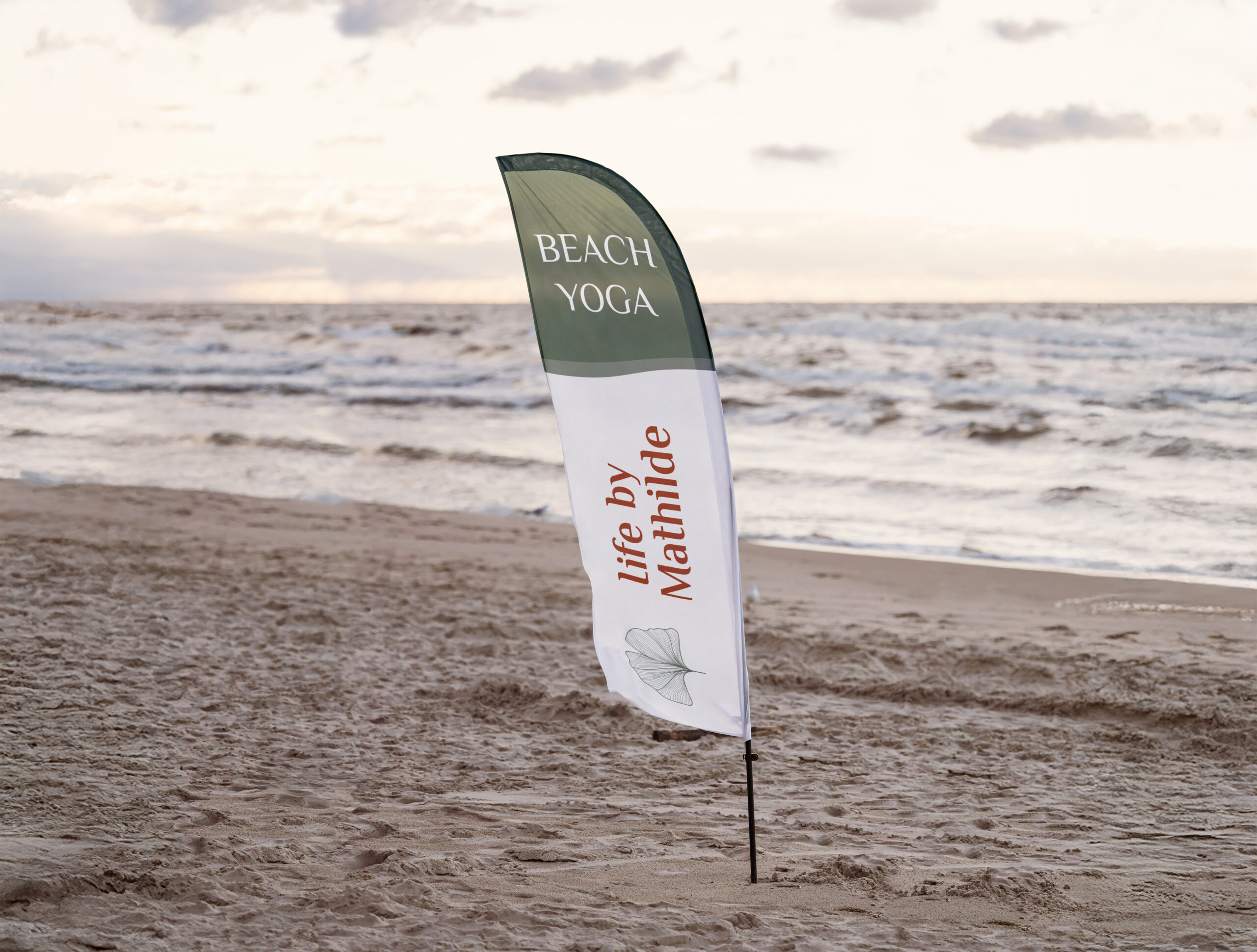
Life by Mathilde
logo design | brand strategy | print design
We focused on:
Life by Mathilde invites families to discover a mindful way of living through yoga, meditation, and gentle yet powerful healing practices. Mathilde creates nurturing spaces where both children and adults can reconnect with their bodies, calm their minds, and cultivate balance in everyday life.
We worked on a brand refresh to bring greater clarity, softness, and cohesion to her identity. The visual language was simplified through a more minimal logo and refined elements, reflecting a mindful and intentional approach to life.
The resulting identity feels calm, grounded, and authentic — supporting Mathilde’s holistic work while remaining accessible and nurturing for the whole family.
Bringing new vision on:
👁️ Logo Refresh
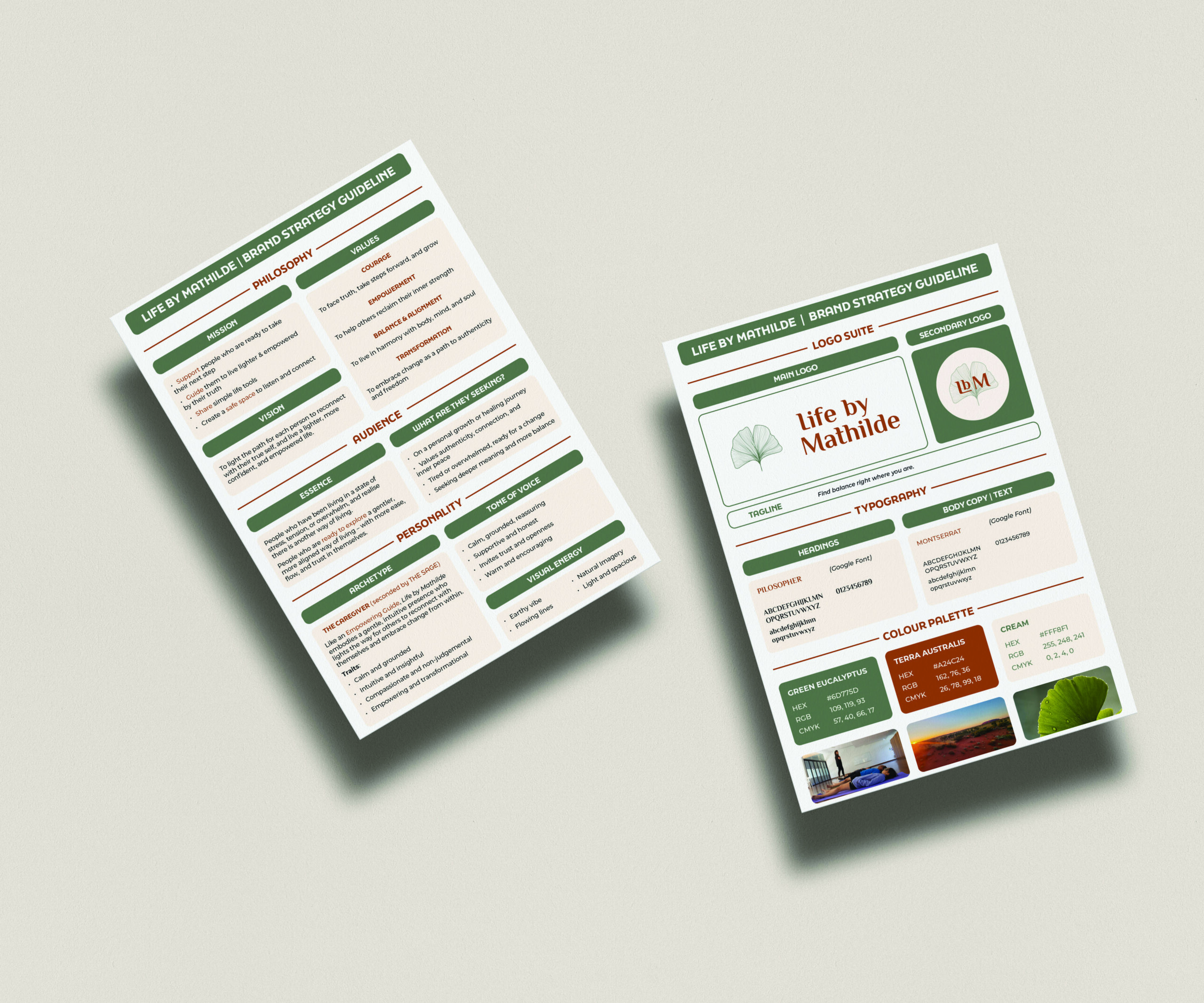
👁️ Brand Strategy
👁️ Updated Brand Style Guide: New Colour Palette & Typeface Selection
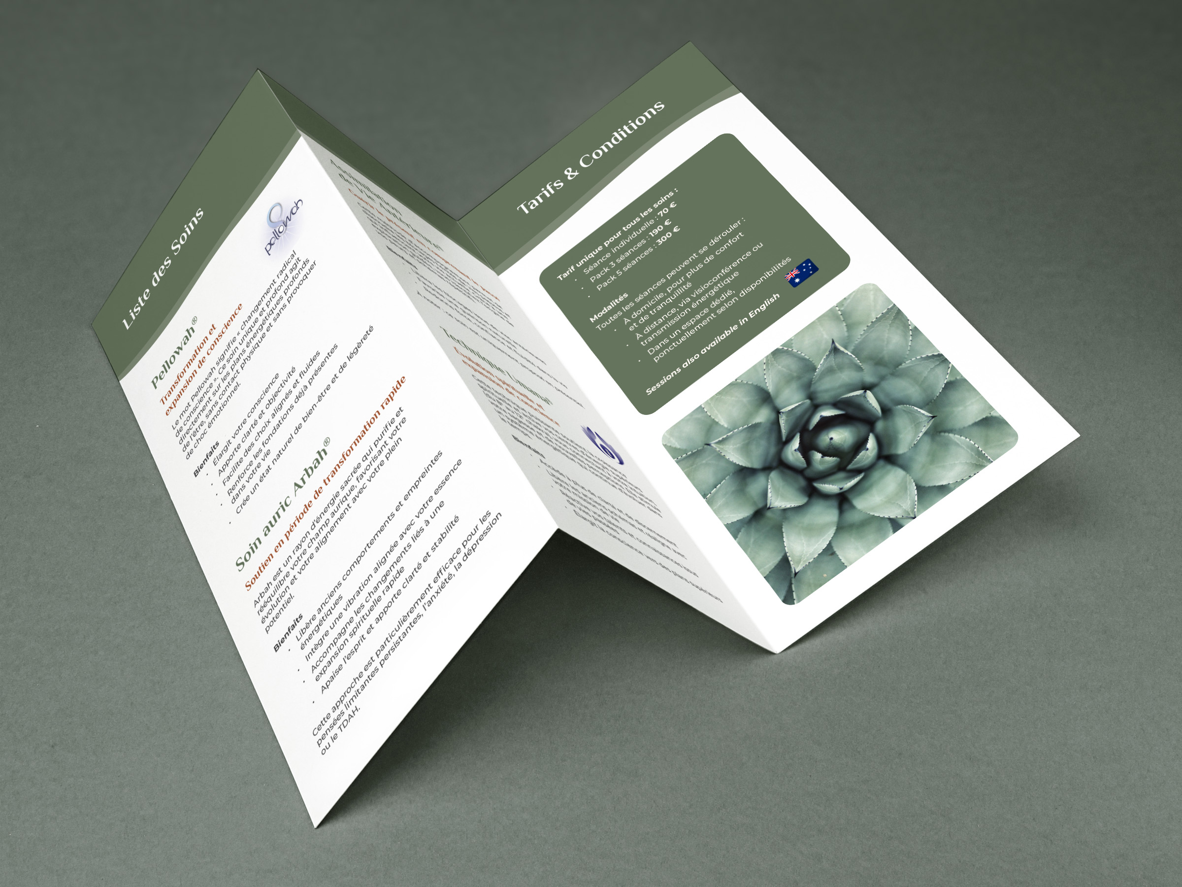
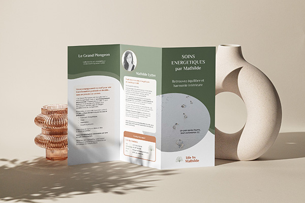
👁️ Stationery Design (Trifold Flyer, Business Card)

From Vision to Reality
Creative Process
This project is rooted in time spent listening, observing, and engaging in meaningful conversations and reflection.
Together, we explored Mathilde’s values and intentions, gently peeling back the layers to reconnect with her essence. From there, the focus was on simplification — removing what felt unnecessary to allow clarity, softness, and balance to emerge.
Each design choice was guided by a sense of calm and presence, ensuring the identity feels aligned, intuitive, and true to her mindful approach to life.
Liking what you see?
Let’s connect!