
FOCUS ON…
Robert Black Electrical
logo design | brand strategy
We focused on:
Robert Black Electrical brings engineering, heritage, confidence and reliability to Brisbane’s industrial and commercial sector since 2009. Rob is the third generation of electricians in his family, carrying forward a legacy of hands-on technical mastery. When Rob takes on a job, he sees it through personally, start to finish, no handoffs, no shortcuts. He’s not just an electrician… he’s an engineer who genuinely loves a good electrical challenge.
His old logo didn’t reflect who he was anymore. His words were “it looks too much like a plumber’s logo.” What he needed was a mark that could carry three generations of work, without falling into the usual clichés of the trade (no lightning bolts, no bulbs).
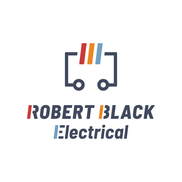
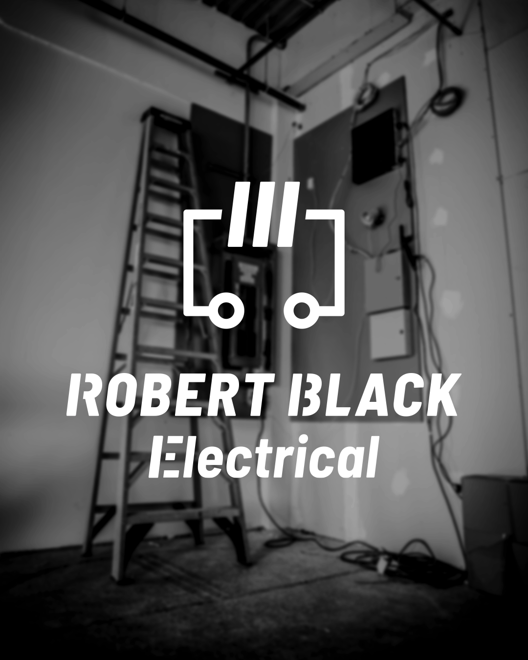
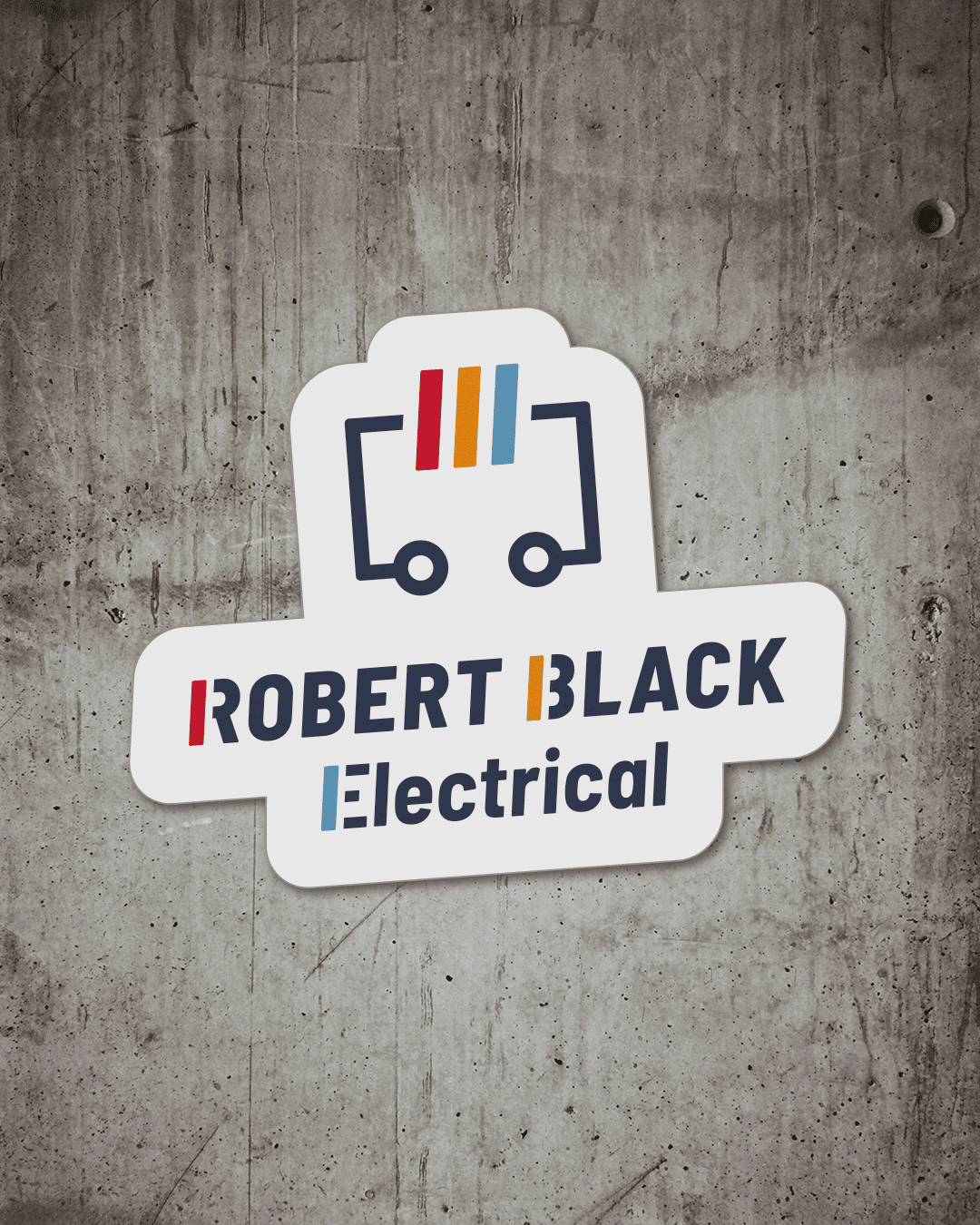
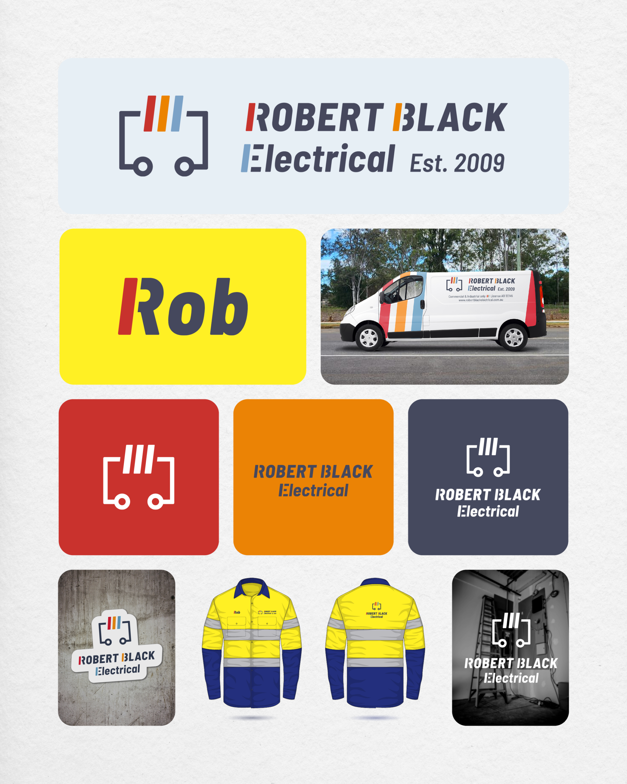
The new logo combines the three tilted bars, inherited from his dad and grandfather’s original logo, with a circuit structure. Together they tell two stories at once: the trade (precision, structure) and the name (heritage, continuity, reliability since 2009).
Bringing new vision on:
👁️ Logo Design
👁️ Brand Strategy
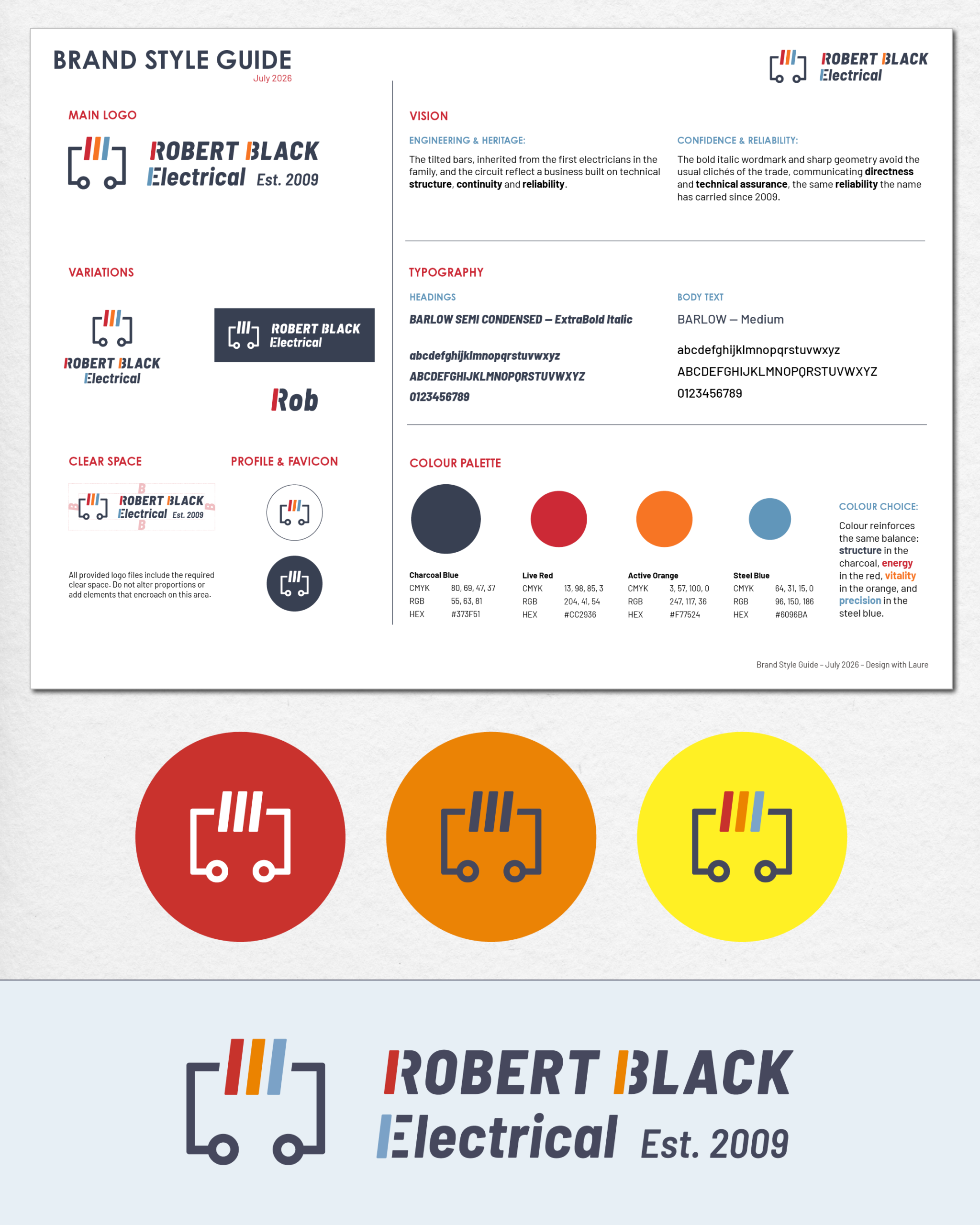
👁️ Brand Style Guide: New Colour Palette & Typeface Selection
👁️ Design for Uniform
From Vision to Reality
Creative Process
The brief was clear. No electrical clichés. So we decided to go more towards some of the industrial symbols used in the trade. The result combines the three tilted bars (a direct reinterpretation of the family’s original logo) paired with a circuit structure. The bold italic wordmark echoes the same angular geometry as the mark, so type and symbol read as one system. Colour reinforces that same balance: structure in the charcoal, energy in the live red, vitality in the orange, and precision in the steel blue. (That same orange marks a live wire on an industrial switchboard.)
Liking what you see?
Let’s connect!